Roi Soleil - Branding

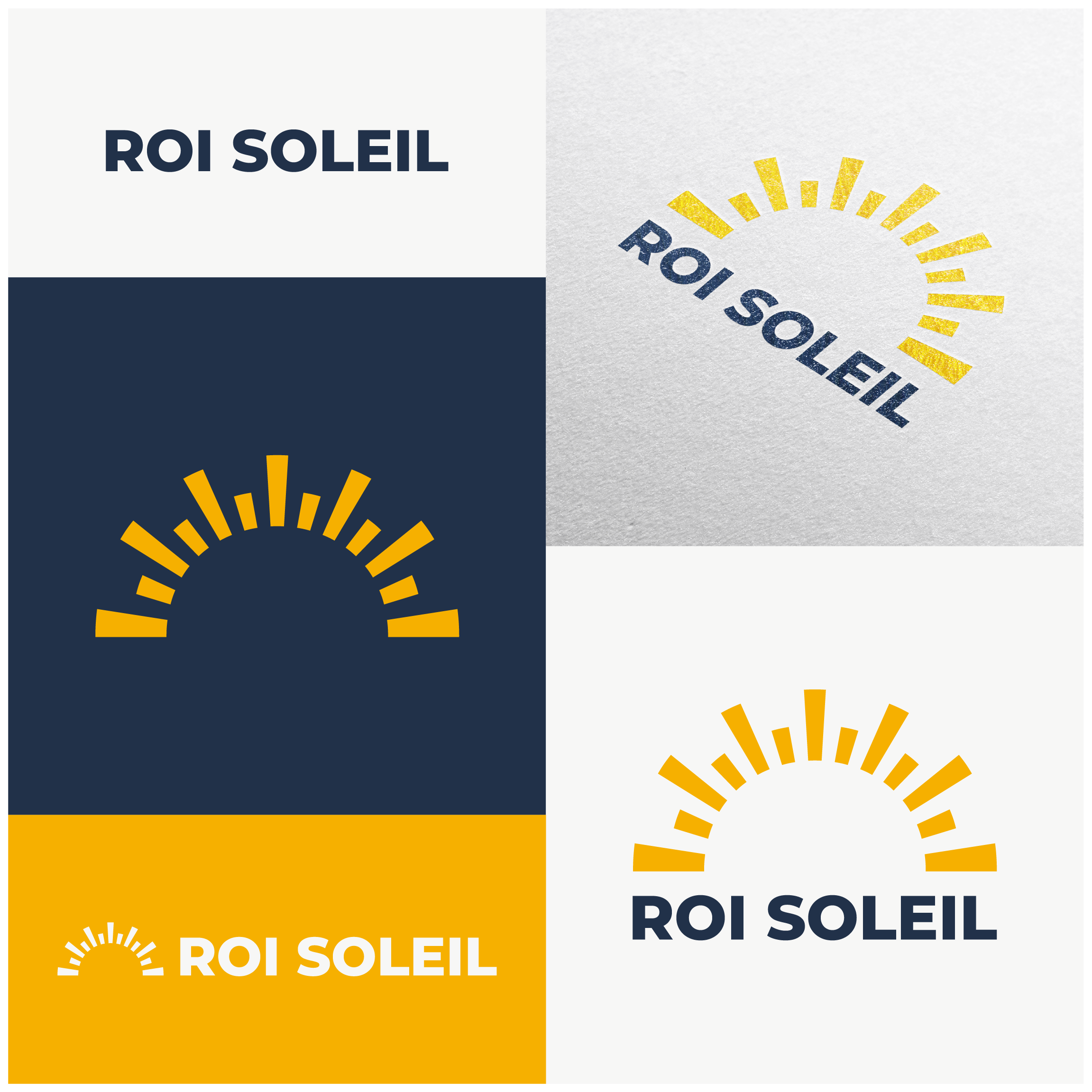
The crown and sun ray design in the logo for Roi Soleil is a clever and effective way to represent the company's name. "Roi Soleil" translates to "Sun King" in French, and the sun ray design is a clear reference to the sun. Meanwhile, the crown symbolizes royalty, which is a fitting complement to the name.
The combination of the crown and sun ray design makes the logo unique and memorable, while also effectively communicating the essence of the brand. The yellow-orange and dark blue color scheme adds to the overall effect, making the logo both warm and inviting, yet sophisticated and professional.
Overall, the logo for Roi Soleil is well-designed and thoughtfully crafted. It effectively represents the name of the company, while also conveying its core values of luxury, warmth, and personalization.

